This Is What a Contact Tracing App Could Look Like
Here’s how a team of veteran designers is working together to help stop the spread of Covid-19

Numerous teams around the world have started building apps that can help with tracing the contacts of people who have tested positive for the coronavirus. This would allow health agencies to test and potentially isolate these people at an early stage before they can infect others.
Building a contact tracing app, however, is only part of the problem: People must understand both the importance of such a tool as well as how to use it. To help with that, we built an open-source user interface that’s free for anyone to use, with the aim of providing a design that is inclusive, easy to implement, and universally accessible to the public.
There is a growing consensus around the use of Bluetooth Low Energy (BLE), a technology available on most smartphones, as an effective tool to anonymously track the people with whom you have been in close proximity. We previously wrote a post trying to convince Apple and Google to collaborate in order to make this a viable option. To our delight, they soon announced they would do exactly that by launching privacy-friendly contact tracing APIs at the end of April. Bluetooth has many shortcomings, and it’s far from perfect. But, until a different approach gains traction, we’ll assume Bluetooth will be used by the majority of contact tracing apps.
Most initiatives so far have primarily focused on solving the technical challenges. For contact tracing to have a meaningful impact, however, there are several other problems and broader societal questions that need to be answered.
One of these challenges is distribution and adoption. Contact tracing apps will only have a useful impact if they are adopted by the majority of the population — according to a recent report in the Wall Street Journal, researchers believe at least 60% of the population needs to participate for them to be successful. If usage is voluntary, this means that people will have to understand how the app works and how it benefits and impacts them before they will actively start downloading and using it.
For an app to successfully reach 60% of the population, it can’t just be designed for the avid smartphone user with an iPhone 11 Pro; it also needs to be usable by people with older phones. And, in order to be inclusive, you’ll also have to take into account the various groups of people with accessibility challenges.
Usually, a process like this would take months, but governments are trying to build these apps in a matter of days. By releasing Open UI, an open-source user interface for contact tracing apps, we hope to help governments build contact tracing apps that can be quickly deployed and used by as many people as possible.
There will be lots of room for improvement in the first version of Open UI, but we hope it’ll help to inspire others to take into account the many challenges that come with designing an app for 100% of smartphone users.
Design principles
We defined four design principles that we believe any contact tracing app should adhere to:
- The application is designed for a broad-base audience spanning demographics and degree of technological literacy.
To achieve at least a 60% adoption rate, we should design an app that works for 100% of the population, as not all potential users will actually end up using it. The UI should prioritize accessibility and be easy to understand by anyone. Accessibility should trump aesthetics. - The app should clearly explain how it works and reassure users about data privacy and security.
There will be a lot of questions about security and privacy. It’s not our goal to come up with technical solutions, but we can think about ways to clearly explain how the application works from a technical point of view, to allow people to make an informed decision. - The design should be scalable.
The app will need to be installed on a very wide variety of devices, including older models. This means there will be significant limitations when it comes to screen size, processing power, and more. It’s also important that the app is easy to localize without making changes to the design. - The design should be easy to implement.
There’s very little time to build these apps, despite the complexity required. Engineers should spend the least amount of time implementing the design. This translates to using as many standard operating system UI elements as possible.
User journey and use cases
Open UI assumes that the app will be built for the following use cases:
- Learn and download
We believe that governments and health agencies will have a big role to play in the adoption of the app. That said, we should leave no stone unturned and follow standard performance marketing tactics. Design also has a role to play here, by choosing a recognizable app icon and selecting colors that match the government’s style guide. This will increase the trust the user has in the product. - Onboarding
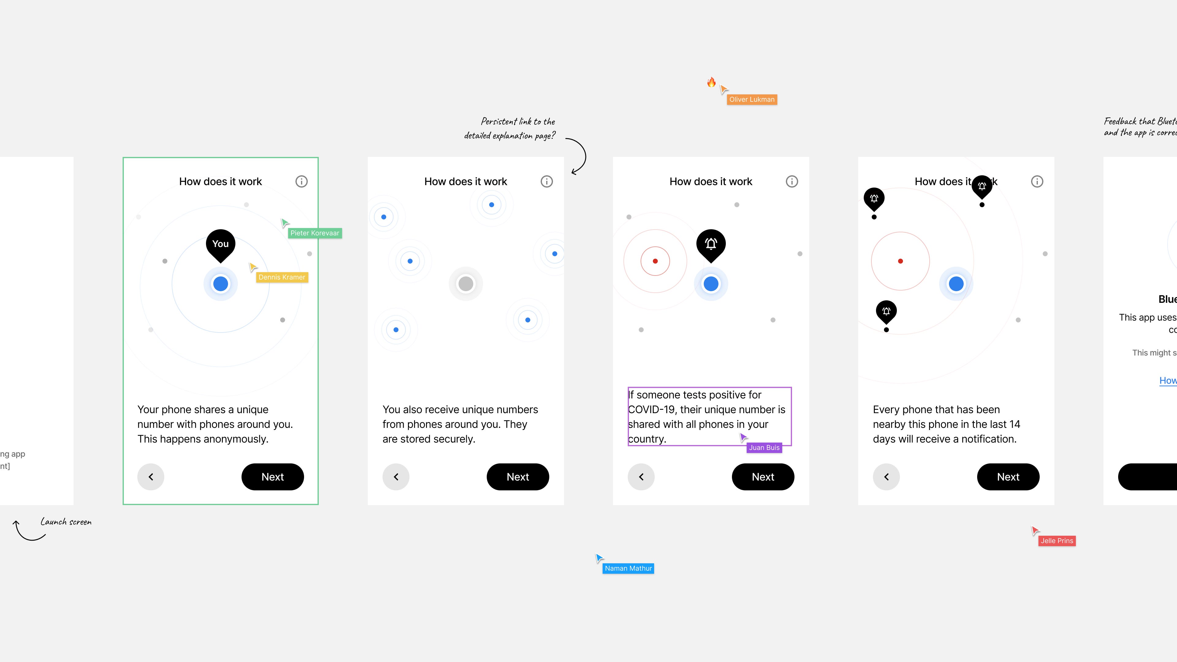
As we outlined earlier, adoption is an important design challenge for this app. Communicating both the value proposition and how the app works in an abstract and easy to understand way can help convince users to use the app.

- Daily usage
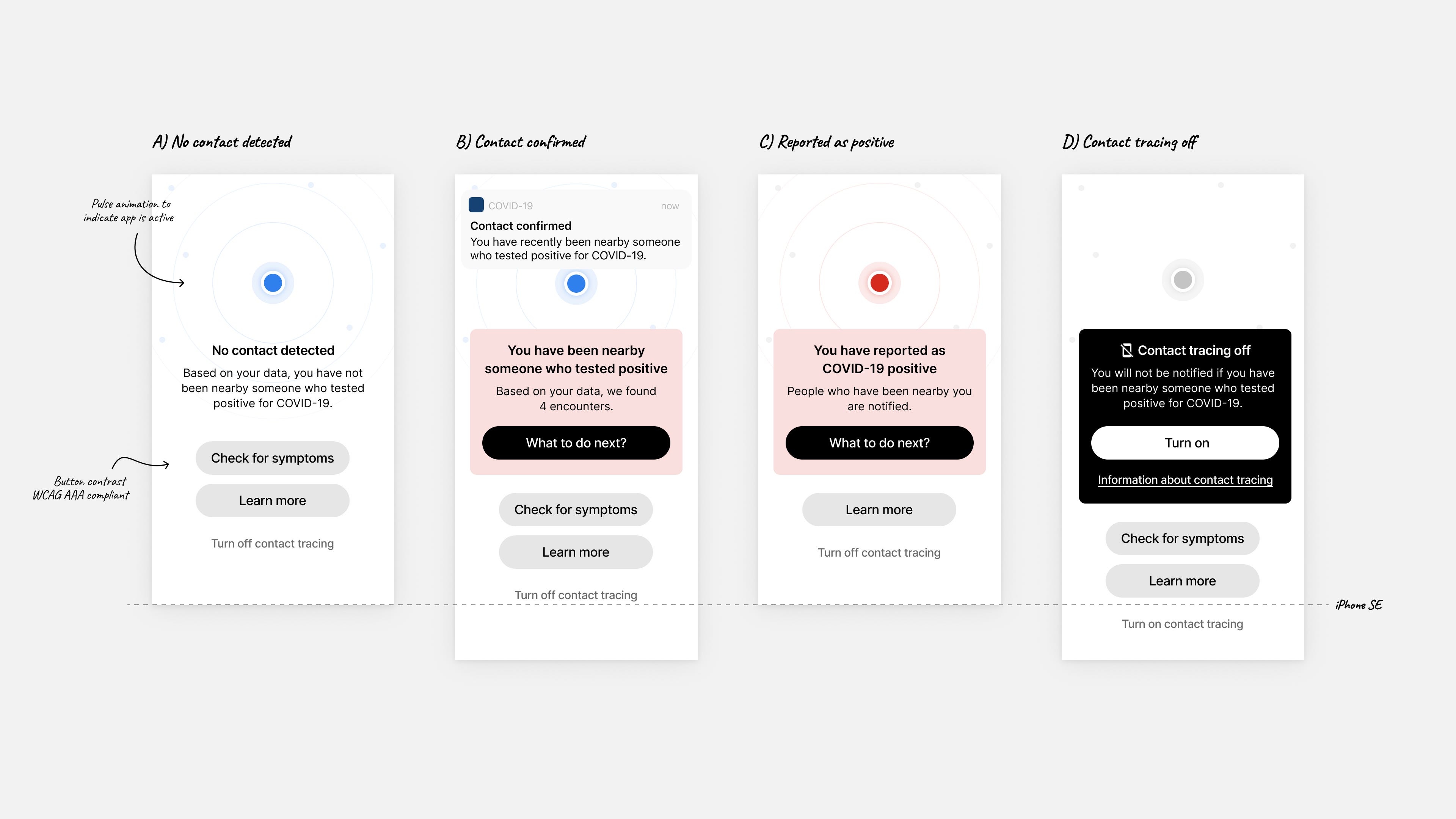
On a daily basis, users will want to make sure their app is working correctly and know whether they have recently been in the proximity of someone who has tested positive. If they have been close to a confirmed case, are showing symptoms, or have tested positive themselves, users will want information on what to do next.

Design considerations
We made many design decisions that would ultimately shape the app. By explaining our considerations, others will not only be able to argue their merits but also follow our recommendations when designing a similar app. We won’t be able to touch on every point, but we’ll discuss the ones that we spent more time on or those where we thought the outcome wasn’t immediately obvious.
Onboarding
The onboarding experience has three high-level goals:
- Explain the concept of contact tracing in general, and how an app could help the user and the wider population.
- Explain how the application works, in easy-to-understand language, to allow users to make an informed judgment. A good rule of thumb to follow is using literacy tools and targeting a seventh-grade reading level.
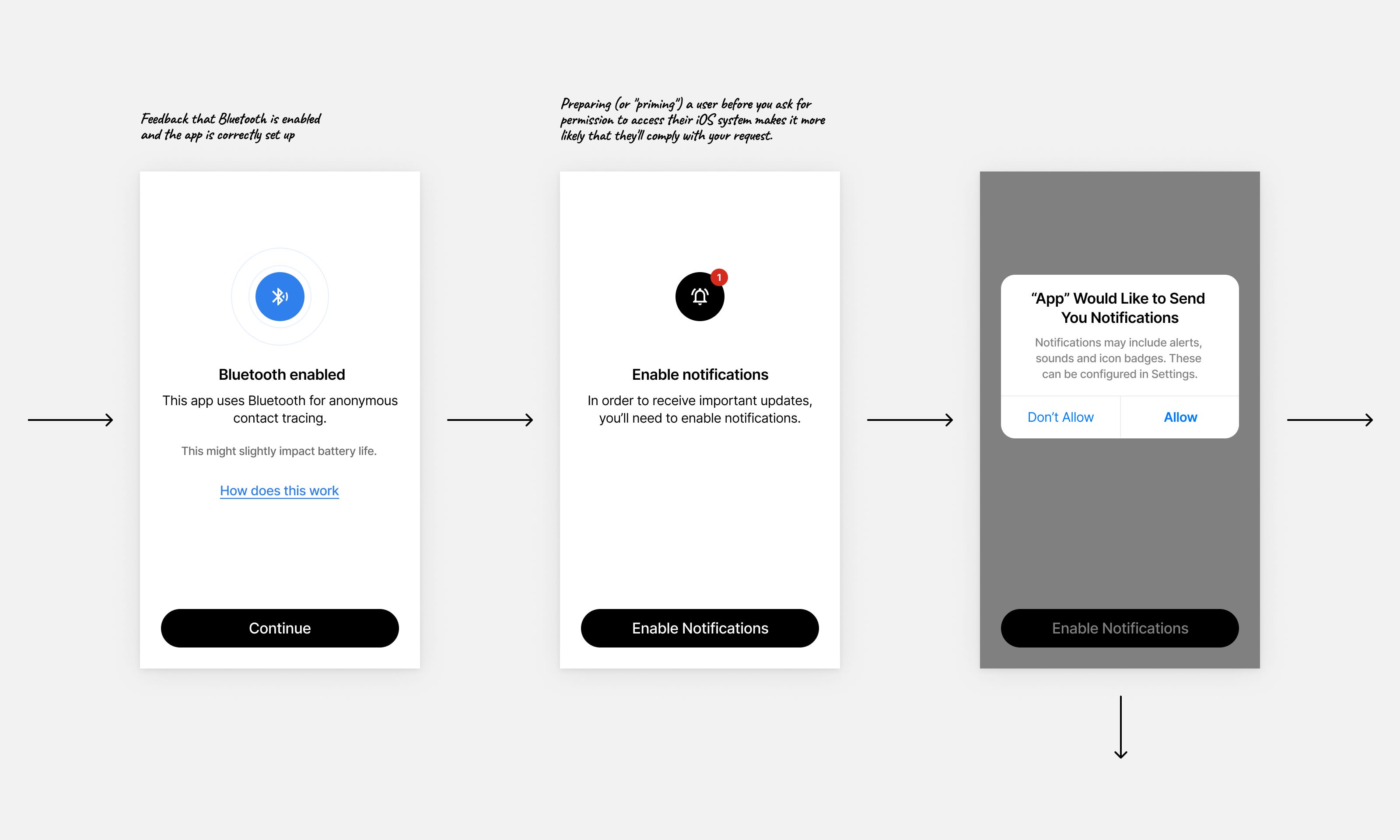
- Guide users to enable push notifications and persistent Bluetooth to allow the app to function properly.

- From our experience with building other apps, we can say that roughly 30%–60% of the population has Bluetooth turned off. Google and Apple might address this as part of their upcoming APIs, but it’s still important we guide users on how to enable Bluetooth. It’s not necessarily a straightforward action for everyone, and the steps to take slightly differ per OS.

- The onboarding seamlessly flows into the status screen in such a way that the concepts explained earlier are immediately recognizable on the status screen.
Daily usage/status screen

- We assume that anyone who downloads the app wants to use it. Therefore, we opted to automatically log the anonymous IDs of nearby devices by default, using the Google and Apple APIs, unless you actively disable the tool.
- We contemplated whether we should ask an additional action from the user before logging their contacts, but we felt that it could give people the impression that the app was already actively logging their contacts, while it actually still required additional input from them. We chose to make it possible to “pause” contact tracing, but made the option secondary to the other options on the screen.
- Users should understand that if we haven’t detected that they have been near someone who recently tested positive, that doesn’t guarantee that they’re in the clear. They may have been close to someone who carried Covid-19 but didn’t test positive yet or didn’t have the app running. Additionally, there are other ways you can get infected without being in close proximity to someone — for example, touching the same surface shortly after someone who is carrying the virus.
- Users will have questions — whether they have been near someone who tested positive, if they themselves tested positive, or if they are experiencing symptoms. It’s important to recognize this and provide them with critical information, references, and relevant contact information. Because guidance on the topic can differ per country, we only designed entry points, without providing the content. This is left to the local public health organizations.
- When we notify someone that they have been in proximity to someone who tested positive, it’s important to provide them with clear next steps. These steps will differ per country. We won’t decide on what’s the right guidance, but rather design an entry point so authorities can provide the actual content.
- If you have been in proximity to someone who tested positive, it’s important to know on which day it happened. While we can’t tell you if you’ve met with multiple different people who tested positive, we can tell you on which days you encountered people who tested positive.
- It’s important to note that this could potentially have privacy implications, and thus the decision will need to be made if such information should be shared. This surface is provided for use, but it’s up to health care authorities to decide whether to enable it.
- Preventing trolls from reporting themselves as having tested positive is essential. We believe the only way someone should be able to report themselves as infected and notify the people they have been in proximity with is by obtaining a code via local health authorities. The user could, for example, get a one-time password that allows them to report their positive status and upload their keys to the server. If this is not done properly, and people could potentially falsely report themselves as infected, it would be irresponsible to automatically ask those who have been in proximity to positive cases to self-quarantine for 14 days.
Communication in the app
When building an app, the words you pick are vital to its success — especially when the product is as critical as this one. We’ll explain some of the considerations to keep in mind when writing for contact tracing apps.
First off, it’s important to use words that anyone can understand, no matter their literacy. When building a product that’s meant to be used by as many people as possible, you have to avoid phrases that require any degree of literary or technological knowledge.
It’s also vital to avoid any copy that can be easily misunderstood — in particular for a sensitive situation like the current crisis. For example, you don’t want anyone to accidentally think they have been in contact with someone who tested positive.
Finally, make sure to follow basic UX writing principles. Writing for digital products, and specifically, smartphone apps comes with a set of specific challenges. This article provides a good overview of what you need to know to get started. For advice on UX writing, please contact Juan Buis.
Other considerations
- Using Dynamic Type, the app can easily scale to various screen sizes. The fonts will also automatically increase for users who have enabled larger fonts on their devices.
- Support for screen readers will increase accessibility. On iOS, VoiceOver works automatically if the designs are implemented according to standards. Android support for screen readers requires additional meta-data labels to be added for TalkBack to work.
- Follow WCAG guidelines for proper contrast ratios.
- In the interest of time, we only designed iOS flows. While Android flows should follow the same principles, they will require some changes to adhere to the platform’s standards.
Beyond the minimal viable product
For the first version of this design, we focused on the bare minimum that we believe is required to deliver a good experience that can be quickly deployed. We do, however, have ideas that would be interesting to explore in the future.
- It’s harder for the virus to spread if we keep a distance from each other. We are, however, social creatures, and keeping a distance or meeting fewer people on a daily basis can be hard. Since the app logs your encounters, we can provide users with some high-level insights into their own social distancing efforts. For example, we can provide users with a daily or weekly report noting whether their encounters increased or decreased. We can also estimate whether they’re meeting more or fewer people than the average person.
- Getting the app installed on as many phones as possible is critical to the app’s success. It will be important to help people share the app with friends and family, and provide instructions on how to install it. We could potentially even show the percentage of the population that has installed the app, and how many more would need to do so for it to be effective.
- If this app becomes available, organizations will look at how it could be used beyond its intended functions. For example, some parties might require users to show the app to prove that they have it enabled and have not been in proximity to someone who tested positive. While allowing or preventing this kind of behavior is ultimately up to the government, in the interest of privacy we could add an option that would allow users to hide their status. We could also give the option to erase all your data and restore it to its initial state.

User research
We have not been able to run user tests to the extent that we would normally do. If you use our designs as a template, we highly advise you to run extensive user tests with a broad demographic. We expect that you will run into things that we had not foreseen, and there will be surprises once users start to actually use the app. For any advice, please reach out to @naman__m.
Advice to governments
It’s advisable to explore multiple paths simultaneously, instead of focusing on only one solution, especially when there are so many unknowns. In the Netherlands, the government has come to the conclusion that a contact tracing app would be vital to get us out of this lockdown. It’s great to see governments worldwide embrace the possibilities of using technology, but it’s important to utilize multiple approaches to help to curb the impact of Covid-19.
Other solutions could be more effective or desirable. For example, New Zealanders are asked to keep a diary that could help trace their contacts, and other countries are scaling traditional contact tracing teams by increasing their workforce. It’s hard to predict which path will ultimately lead to the most effective solution, and it’s possible that a combination of multiple solutions could have the greatest impact.
Even if 90% of the paths explored ultimately lead to a dead-end, opening up the economy even just a day earlier will likely return the investment tenfold.
Additionally, the teams tasked with these challenges should be multidisciplinary and from diverse backgrounds. They should not consist only of engineers and designers, but they should be joined by doctors, epidemiologists, economists, and psychologists.
Contributors
This project has been a labor of love. We’ve designed everything out in the open — first by sharing our initial thoughts on Twitter, later by sharing updates and allowing anyone who had an interest to join our workgroup. The positive response has been great, and it’s incredible to see that various teams around the world have already started to implement our designs or have taken inspiration from them.
If you have thoughts, want to contribute, have questions, or want to ask the team for help, feel free to reach out to @jelleprins. This is an ongoing project and we’re always looking for talented people to join us in this journey.

Open UI Figma file
You can dive into the Open UI Figma file right here. All ideas and designs shared within are free to be used and adapted with attribution under Creative Commons license CC BY 4.0. For help with specific design questions, please contact @ppkorevaar or @denniskramer.
The people who have contributed so far, in alphabetical order:
Dennis Kramer, Emiel Janson, Ginger Kimler, Jasper Hauser, Jelle Prins, Juan Buis, Justus Bruns, Mesbah Sabur, Naman Mathur, Oliver Lukman, Owen Williams, Pieter-Pleun Korevaar, Rick Pastoor.
This is version 1.0 of the article, published on April 27. We will update this article when there are significant new developments.

