 Screens live a double life. They serve us dense information in bright colors, only to transform back into black mirrors. We have gotten used to it, but it doesn’t have to be this way.
As more and more connected devices arrive in our homes, it’s a good time to remember the principles of Calm Technology, first formulated at Xerox PARC in 1995. They talk about how technology should respect our attention and remain in the background most of the time, how relevant information should be presented calmly and make use of the periphery.
In my previous projects, I used two-way mirrors and minimal user interfaces to create smart displays that blend in with the space around them. This time, I turned to e-paper, which achieves similar effects with a matte and non-emissive surface while operating on much less power.
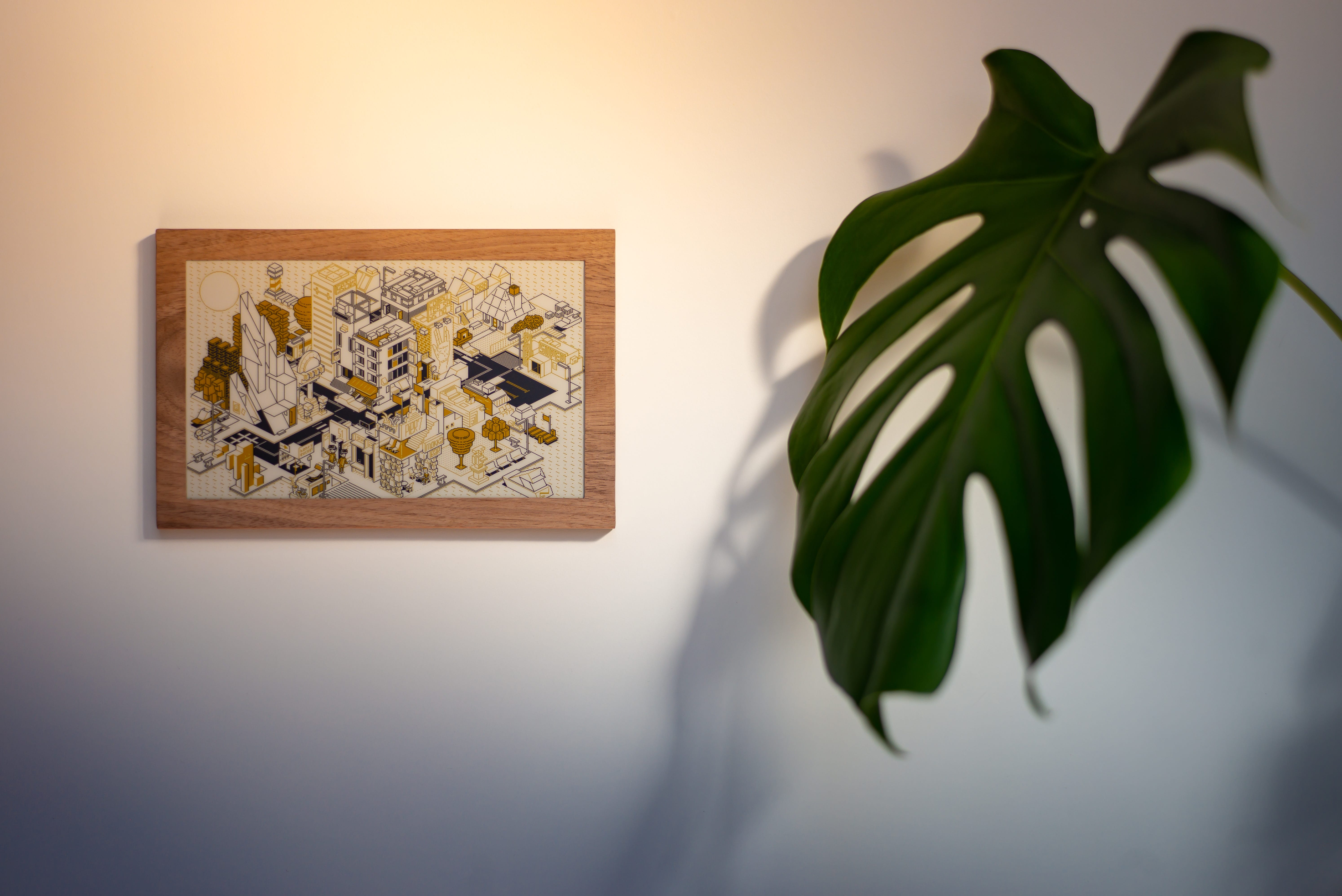
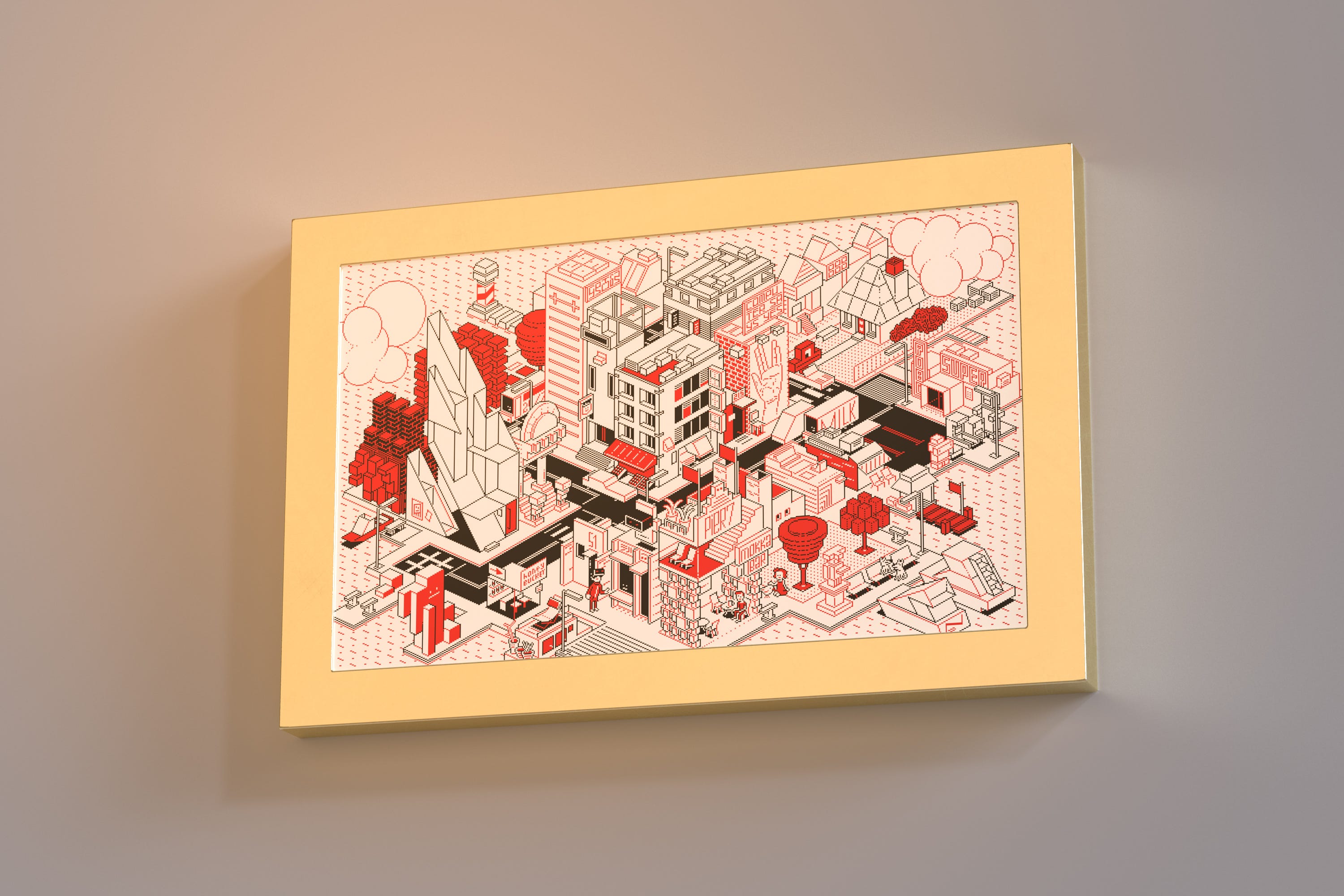
I’m calling it Accent. It’s a small picture frame with a black, white, and red e-paper display. Accent is battery-powered and connects to Wifi, but only changes a few times each day.
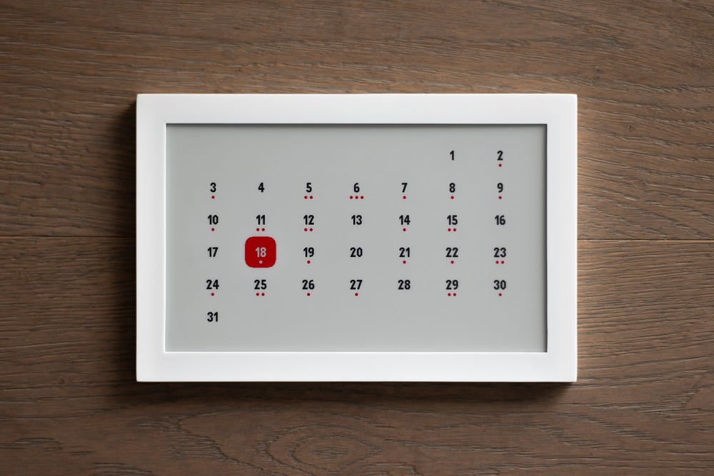
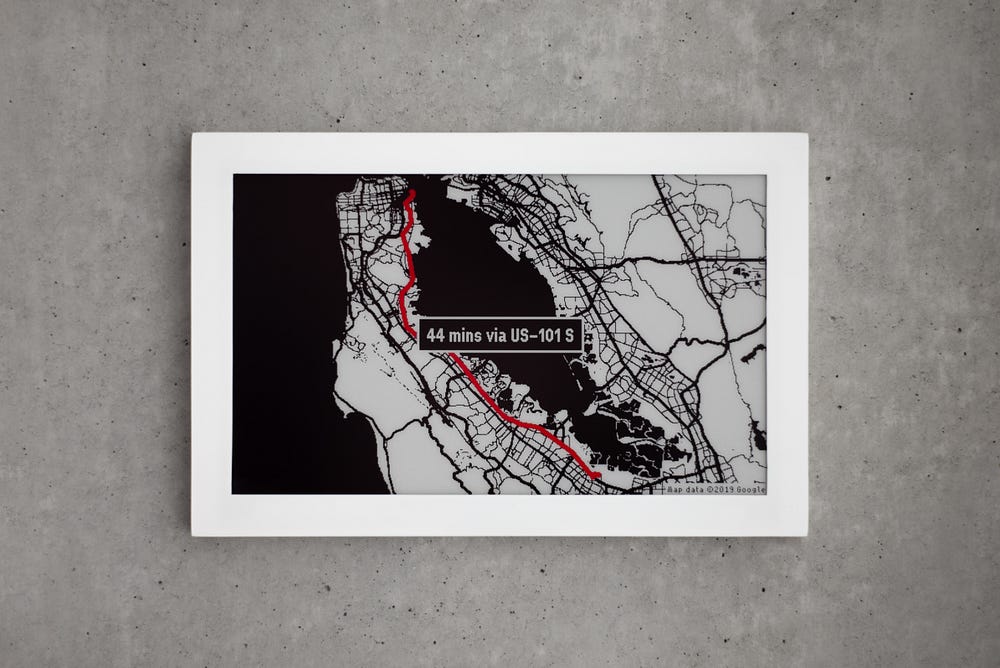
An automatic schedule determines which type of content to show at what times. The latest prototype features a map of the commute on weekday mornings, which is replaced by a calendar on weekends. During any other time, the frame shows custom artwork.
Accent uses very little energy. The e-paper display only consumes power when it changes, which happens infrequently. The computer is a small microcontroller that remains in deep sleep most of the time, waking up briefly to download the latest image and show it.
Using the power-efficient e-paper, however, comes at a price. I only have three colors and the nostalgia-inducing resolution of 640×384 pixels to work with. There’s not even any grayscale, just full black, white, and red. Photos usually don’t look so great on this screen, and there’s definitely a retro feel to it.
I decided to embrace these constraints with some inspiration by the poster above my desk. If you don’t have many pixels, why not place each one with purpose?
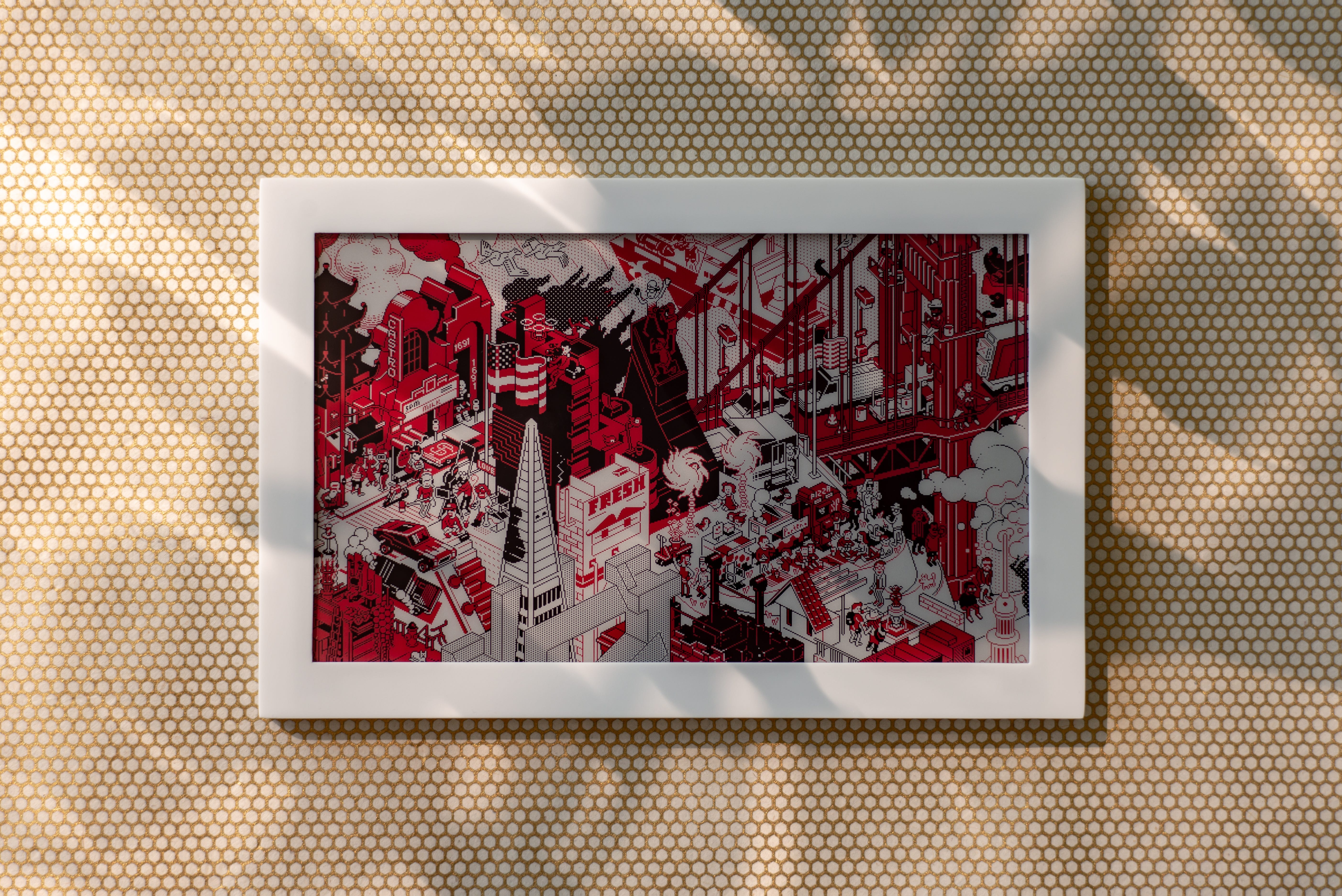
The numbers on the calendar and the text on the map are set in pixel fonts for just this reason. On top of that, I was lucky enough to collaborate with the fantastic team at eBoy to create new pixel artwork specifically for Accent.
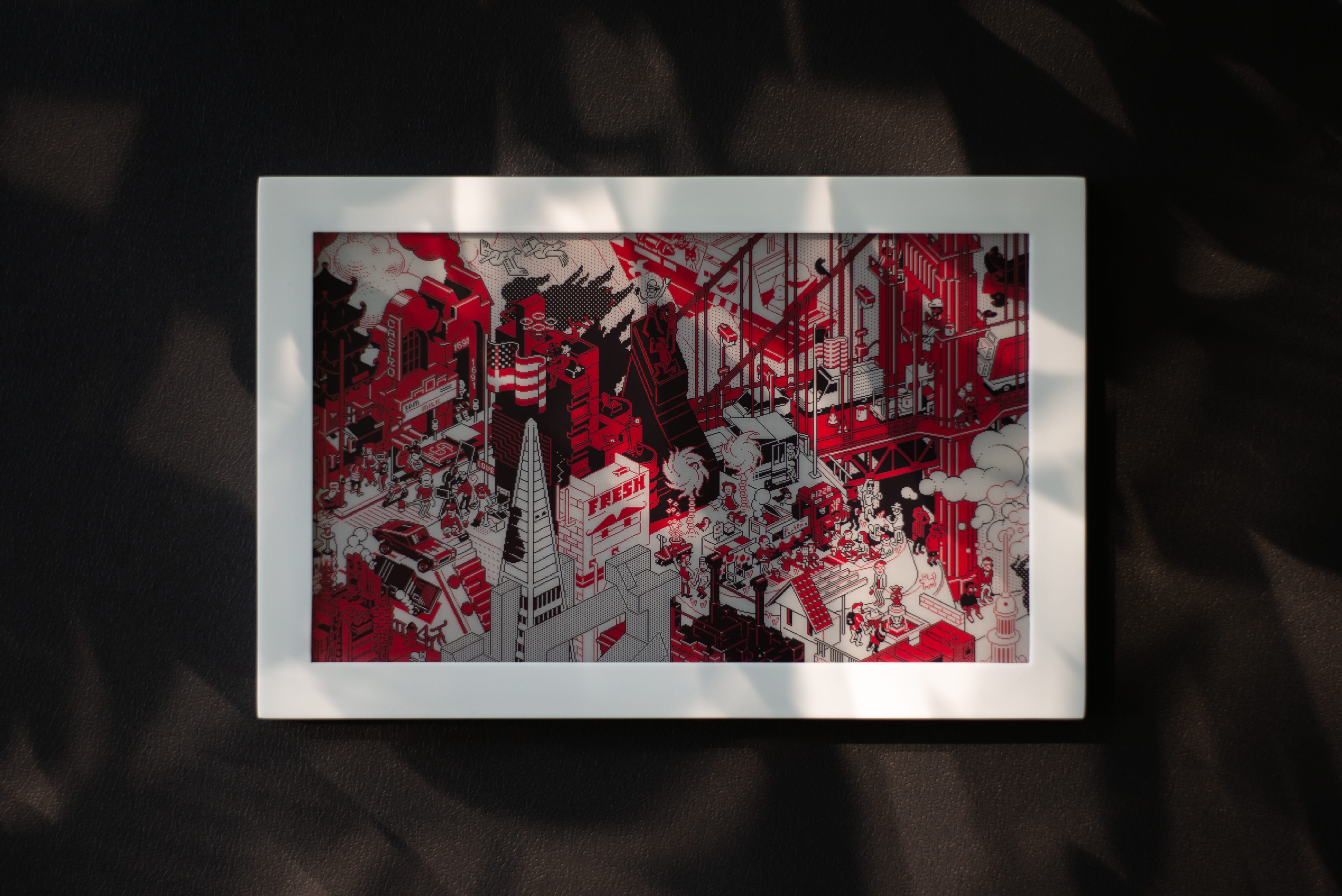
DynaCity is a miniature island town that changes dynamically based on the real world around it. Accent uses the time of day and the weather outside to compose a scene with matching pixel graphics. From day to day, the cars and boats move around, signs change, people know when to pick up an umbrella, and robots do robot things.
Altogether, Accent embodies many Calm Technology principles — often as a serendipitous result of limitations in the technology itself. With the right design choices, I can make the constraints work for me.

The minimal and mostly static user interface is what the e-paper display dictates, yet it also has the effect of requiring little attention and projecting calmness. The screen doesn’t glow and reflects subtle changes of the environmental light, so it blends naturally into the room surrounding it. The automatic content means that Accent can remain in the periphery. The primary user interaction is simply looking at it.
I’m not sure yet where to take the project from here, but I’m curious what you think. Let me know in the comments and follow @AccentInk for updates!

If you’d like to learn more about how Accent works and get a look behind the scenes of building the prototype, then do read on…

 I have been experimenting with different kinds of E Ink displays for a while now. (There’s another Medium article in it, for sure.) For this project, I knew that I wanted a strong accent color and I liked the look of Waveshare’s red 7.5-inch panel.
Waveshare has excellent support for different hardware and software ecosystems. I was able to compare driver boards for Raspberry Pi and ESP8266, eventually landing on Espressif’s more recent ESP32, which has the right set of features and low power consumption.
After deciding on the electrical parts, I explored different shapes and materials for the frame by modeling and rendering a few 3D mock-ups in Blender. (In fact, two of the pictures at the beginning are CG instead of photographs. Can you guess which ones?)
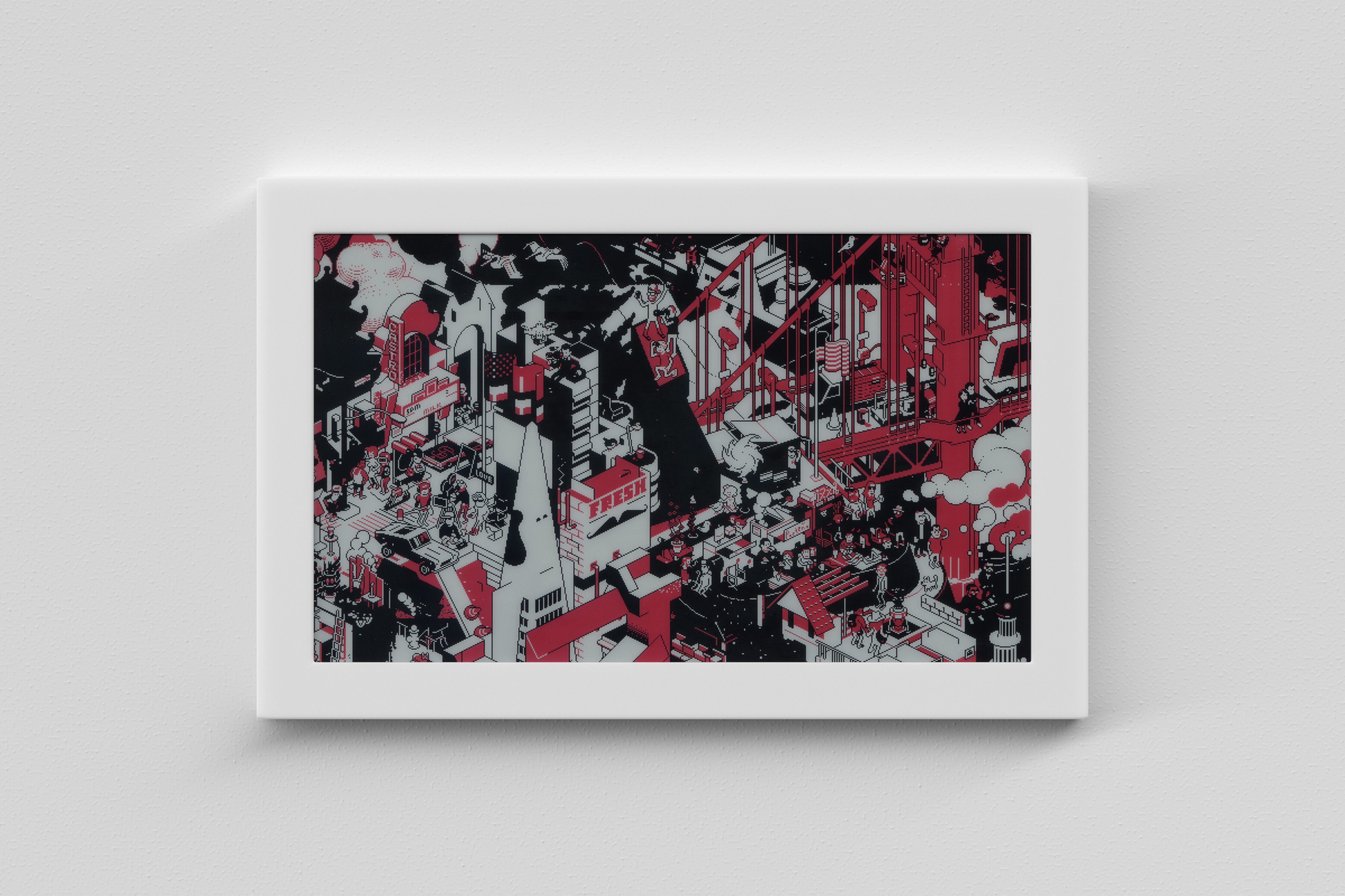
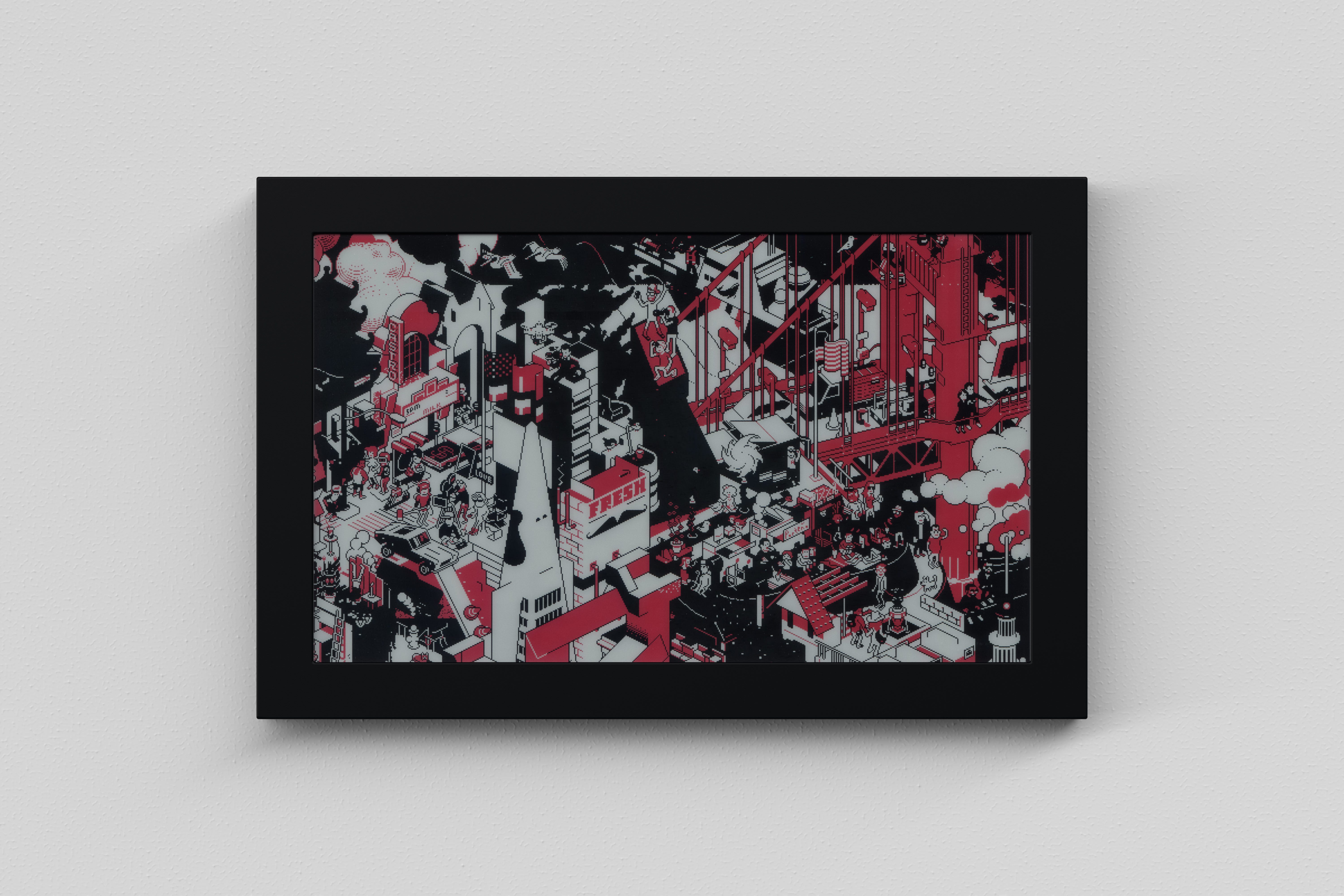
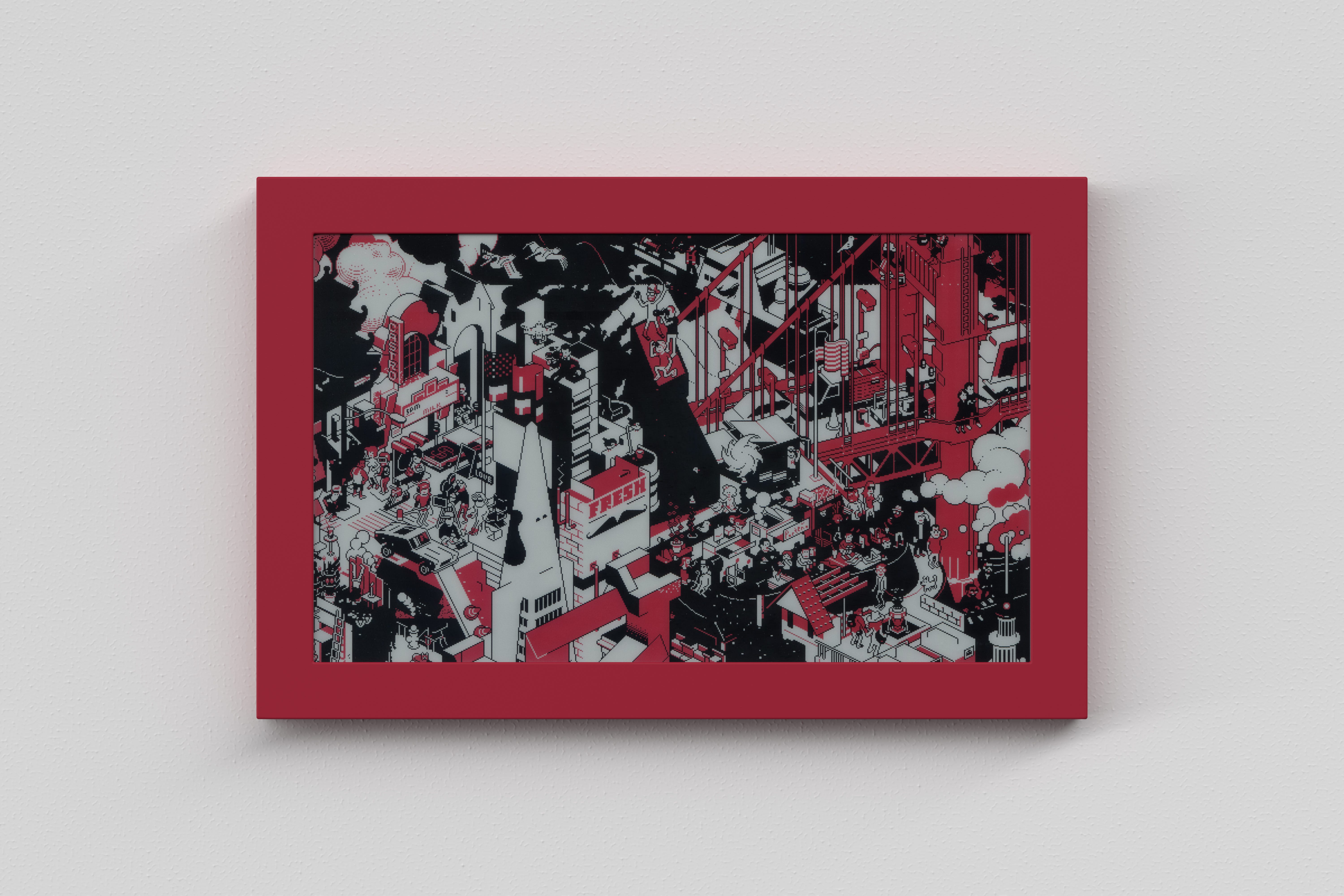
I ended up with a stack of various 3D-printed frames, but I liked none of them as much as the white Corian, which has a clean matte finish and a subtle glow along the edges.
The prototype measures about 7½×5×½ inches. Carving the sheet of Corian into shape with sub-millimeter tolerances was pretty challenging. It was the first serious project for my Shaper Origin, and even though it took some trial and error, I’m pretty happy how it turned out.

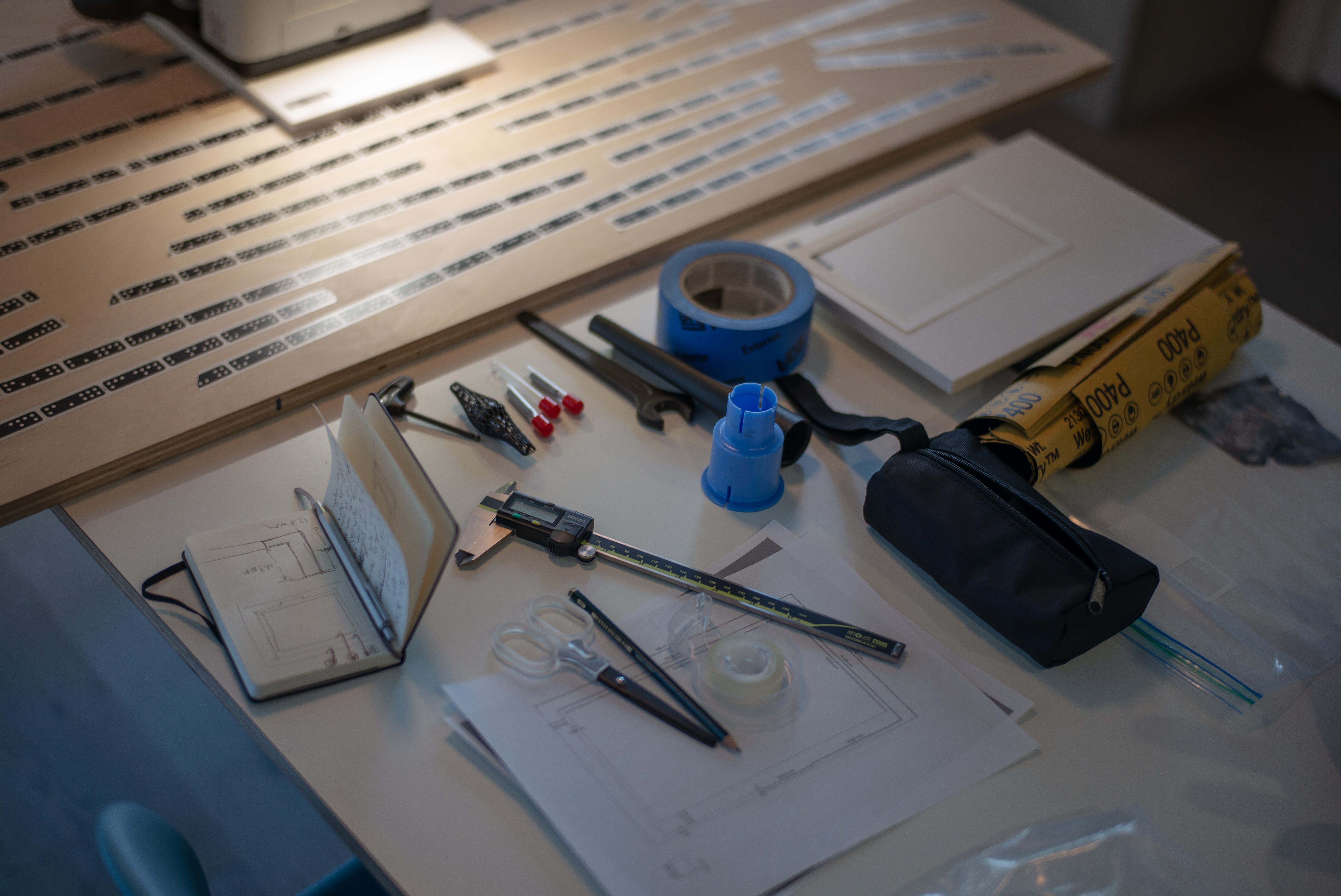
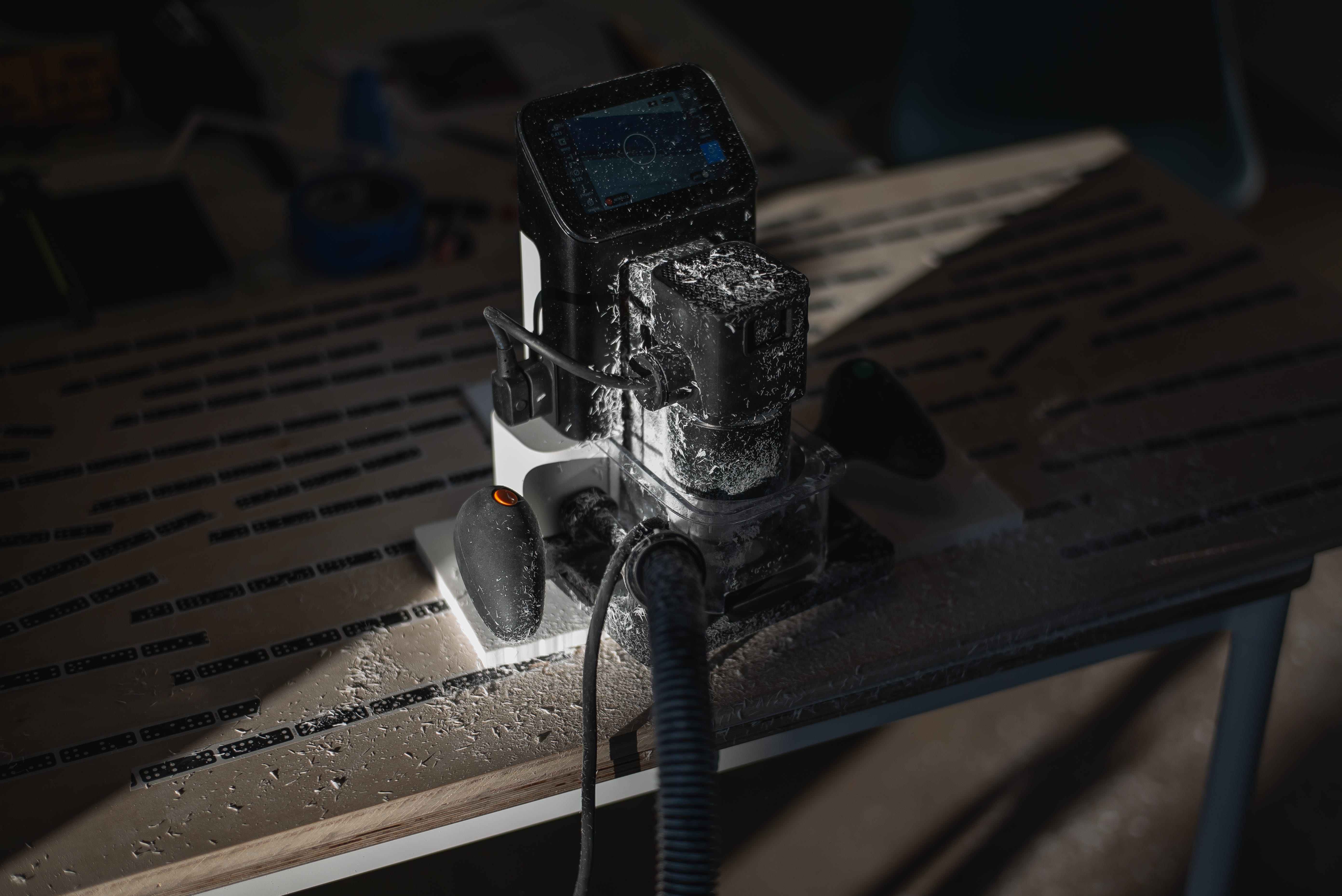
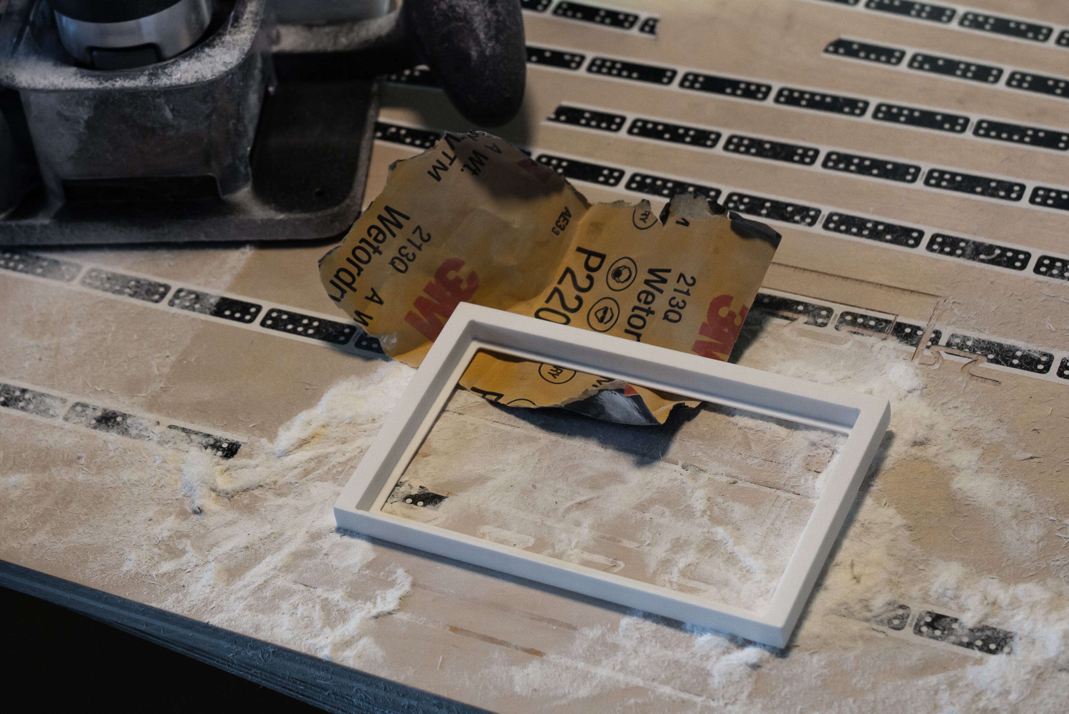
When putting all the pieces together, I opted for simplicity and flexibility, which came in handy when I had to go back and redo parts of the assembly. Think tape, not screws.
A little bit of soldering was needed to connect the ESP32 to a 3.7 V battery instead of relying on higher-voltage USB power. My initial measurements of a typical wake cycle indicate an expected battery life of just over 100 days with an 8000 mAh battery. Once the battery eventually does run out, you can charge it with a separate USB charger.
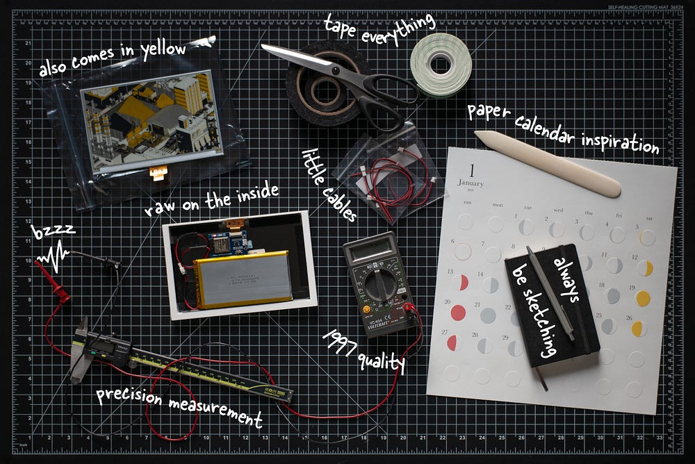
Low power constraints also guided the software architecture. I designed the client to be as thin as possible, while all the application logic lives on the server. The client code is written in Arduino C++, and the server is a Python App Engine project (standard environment, only because that scales to zero).
When the client wakes up, it connects to Wifi, downloads the latest image pixels from the server, and immediately streams them to the display. The server also tells the client how long it should sleep to wake up in time for the next image.
The server consults a schedule of cron expressions to determine which content to render. (I extended the format to support references to sunrise and sunset.) Map imagery and directions come from the Google Maps API, and the Google Calendar API provides the calendar events. The weather for the dynamic city scene comes from the Dark Sky API. The final result is then encoded as a 2-bit image and sent to the client, together with the sleep time offset until the next schedule entry.

I’ve put the source code up on GitHub for reference. The current implementation is fairly basic, with the minimal feature set outlined above and all user data baked in. I have a few improvements in mind, from small tweaks and bugfixes to a voice assistant integration to learning the schedule automatically from usage data.
There are exceptions to the rule of photos not looking so great on the three-color display. I particularly like how this still from 2001: A Space Odyssey turned out after some fine-tuned dithering in Photoshop.


